How to Build Lead Generation Into a Real Estate Website
September 4, 2026
Your best educational article may be attracting exactly the right readers and still producing almost no business.
The problem is often what happens after the answer. Some sites give an interested visitor nowhere useful to go next; others overcorrect with popups, banners, forms, and calls to action that make the article feel like a landing page in disguise.
A better approach to real estate website lead generation is quieter. Let the page satisfy the search intent first, then introduce the next step only when the reader has a reason to take it. You can create a commercial path without turning useful content into a sales obstacle.
Take Apart a Typical High-Traffic Article
Imagine a strong article called “How to Calculate Cap Rate.”
The page ranks well, explains the metric clearly, and attracts relevant investors. Then the conversion layer gets added.
Page position
What the visitor sees
What goes wrong
Before the first paragraph
Newsletter popup
The site asks before delivering value
After 200 words
“Schedule a Call” banner
The action has little connection to the question
Sidebar
Ebook, consultation, newsletter, and service buttons
Too many competing choices
Mid-article
Lead form
Reading is interrupted
End of article
Three CTAs
No obvious next step
Each element can make sense on its own. Together, they change the character of the page.
Google’s guidance on intrusive interstitials notes that promotional overlays can obstruct the main content, frustrate users, and erode trust. The lesson extends beyond search compliance: readers should be able to reach the information they came for without first clearing away the marketing.
Rebuild the Same Page Around Reader Intent
Strip the article back to its real job.
Someone searched for cap rate because they want to understand or use the metric. Start there.
At the Top, Answer the Question
The opening should explain what cap rate is, why it is used, and what the reader will learn. Keep the primary content visible.
A visitor who has not yet decided whether your answer is useful has provided very little commercial signal. There is no need to spend the first screen on a newsletter pitch or consultation offer.
After the First Useful Answer, Offer the Next Useful Step
Once the calculation is clear, the reader may naturally wonder how cap rate fits with cash-on-cash return, NOI, financing, or property comparison.
That is the moment for a contextual link:
Comparing several properties? Use the investment-analysis worksheet.
The CTA works because it continues the task already underway. It does not ask the visitor to switch abruptly from learning to buying.
This is where real estate website lead generation starts to feel like navigation rather than promotion.
Near the End, Let Intent Become More Visible
Someone who reaches the end of a detailed article has shown more interest than a visitor who left after 20 seconds.
A related guide, calculator, case study, or resource page may now be the right bridge. Direct service CTAs can appear when the article itself has a clear commercial connection.
For example, an article about restructuring a large real estate content library could reasonably lead to a page about website planning or content migration. The call to action becomes stronger because the context changed, not because the reader survived enough scrolling.
Lead-generation problems often become navigation problems.
When one article presents eight unrelated offers, the visitor has to decide what the site wants them to do. A stronger approach narrows the possibilities.
One journey might be:
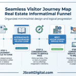
Article → practical resource → case study → service page → inquiry
Someone arriving with stronger intent might move directly through:
Service page → selected work → project inquiry
Nielsen Norman Group’s B2B website usability research emphasizes that business sites often have to support long buying processes while helping people compare options, review evidence, build shortlists, and eventually become leads. Educational material can therefore support the buying process without behaving like sales copy.
Match the CTA to the Page’s Actual Job
Instead of asking whether every page “has a CTA,” ask whether the CTA fits why the page exists.
Page type
Main job
Natural next step
Glossary
Clarify a term
Deeper article or tool
Educational article
Answer a question
Related guide or resource
Calculator
Apply information
Explanation, report, or relevant service
Case study
Demonstrate capability
Expertise or service page
Service page
Explain professional help
Project inquiry
This keeps commercial intensity proportional to visitor intent.
High traffic alone is not a reason to make an educational page more aggressive. A popular glossary entry can remain useful even when its best conversion is simply moving a reader into a deeper resource.
Put Forms Where the Exchange Makes Sense
A form asks for effort and information, so the exchange should be proportional.
For a newsletter, an email address may be enough. A downloadable planning worksheet could justify asking for a name and email. More detail makes sense on a serious project inquiry because the visitor is requesting a tailored response.
Baymard’s UX research on promotional elements has found negative reactions to overly aggressive ads, pop-up banners, and signup overlays. Timing is therefore part of form design: interrupting someone before they complete the task that brought them to the page can work against the conversion you are trying to create.
Keep optional information optional. Collect only what you will use, and reserve longer forms for visitors who have reached a genuinely commercial point.
If lead generation is added after a website is already built, the easy solution is to place the same CTA across dozens or hundreds of pages.
That rarely produces an elegant experience.
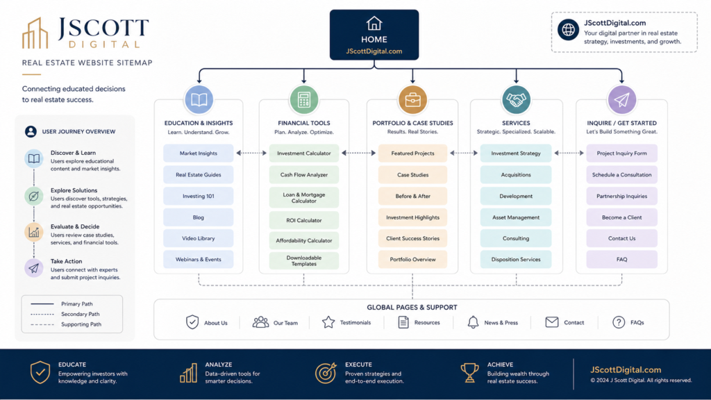
A better real estate website lead generation system is planned into relationships between pages. Articles connect to relevant resources, tools lead to explanations or case studies, and service pages make project inquiries easy to find.
Our Real Estate Websites & Digital Publishing work includes information architecture, resource libraries, landing pages, and lead-generation systems for this reason: the commercial path works better when it grows out of the website structure instead of sitting on top of it.
Measure the Handoffs Before You Judge the Funnel
A completed inquiry is the easiest conversion to see, but it is only the last visible step.
Look earlier. Did article readers move into related resources? Which calculators send visitors toward guides or service pages? Do case studies lead to expertise pages? Where do visitors start a form and stop?
Those handoffs show whether interest is becoming intent.
An article with 2,000 visits and a high rate of relevant internal clicks may contribute more to the business than a 10,000-visit article whose readers rarely explore another page.
The measurement question changes from “Did this article generate a lead?” to “What did interested readers do next?”
The Best Funnel Barely Feels Like One
Educational websites earn attention by being useful. Lead generation should not force you to give up that advantage.
Answer the question first. Provide a logical continuation when the reader wants more, then make commercial pages and inquiry options increasingly visible as intent becomes stronger.
That approach leaves room for people who only came to learn while still giving qualified prospects a clear route toward your business.
Done well, real estate website lead generation does not make an educational site feel more promotional.